before & after

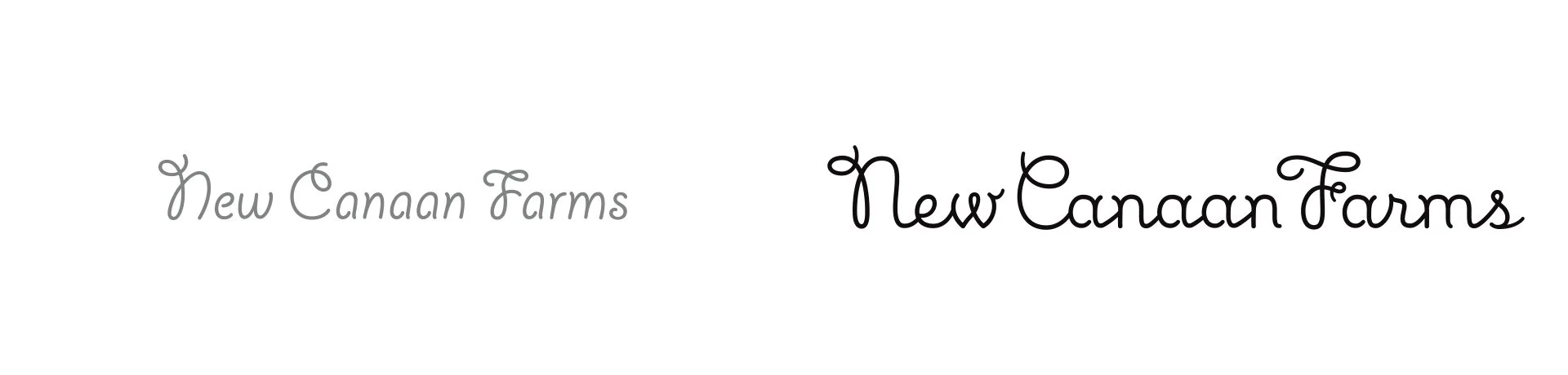
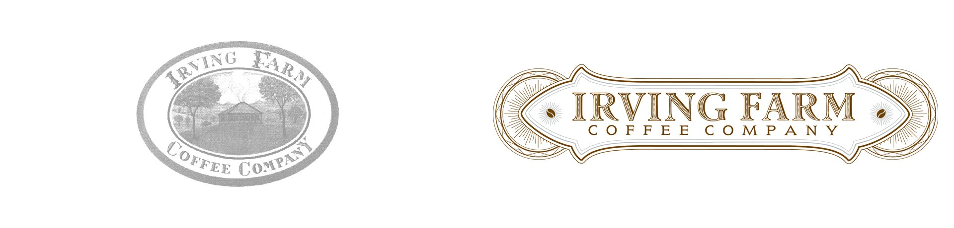
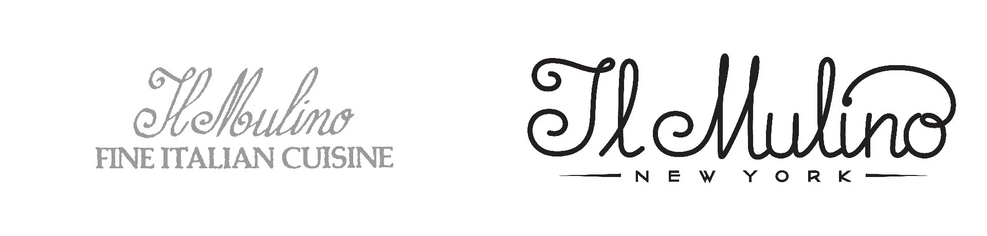
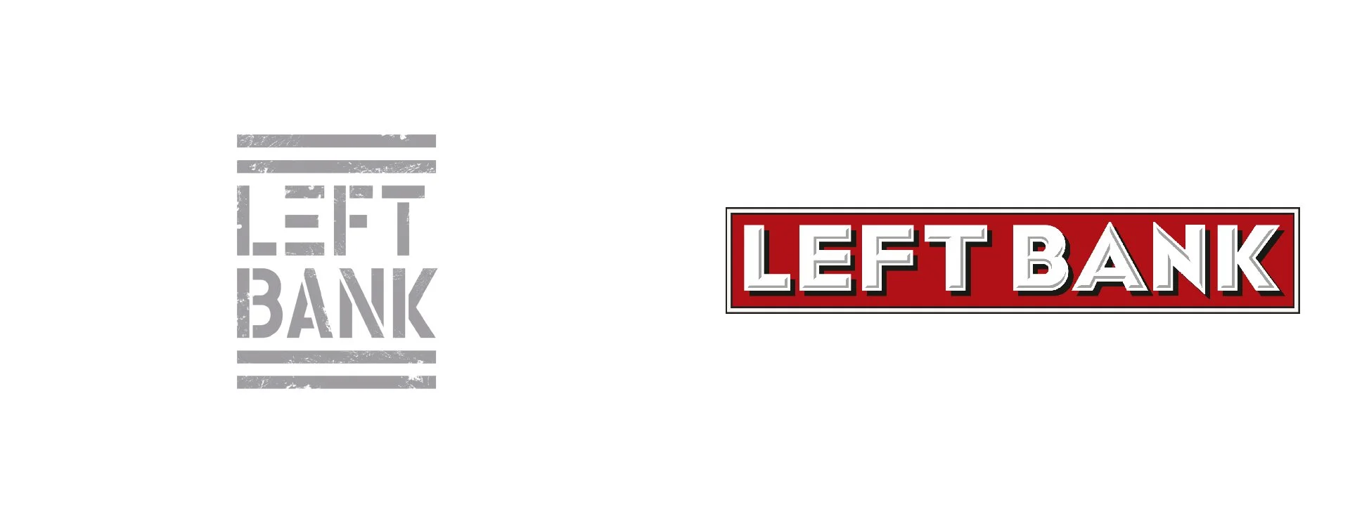
Sometimes a logo can be viable for the entire life of a company and never appear dated or stale. Frequently, however, even the most established logos can benefit from an update. Although some businesses may resist making adjustments to tried and true marks—lest brand recognition be compromised—refreshing old logos can definitely enhance the brand. For a redesign to work, it is best to retain some basic element as an aid in recognition. When rebranding Sarabeth's, for example, the aide de memoire is the oval shape, which is the essence of the original logo. In this way the old is made new, but recognition is maintained. Each logo demands a custom treatment, but in all cases it is important to respect the past while embracing the present. You can view some examples of our successful makeovers here.
Logos


GOOD HOUSEKEEPING

FEW EMBLEMS EVOKE A MORE POSITIVE RESPONSE than the Good Housekeeping Seal. It is such an integral part of American vernacular that it has become a metaphor for anything worthy of approval. Louise Fili Ltd was commissioned to redesign this widely recognized and respected consumer brand on the occasion of its 100th anniversary. Although the seal had been redesigned many times over the past century, Good Housekeeping wanted a return to its classic qualities. Louise Fili Ltd's redesign sought to revive its history—retaining the oval shape and signature star, while imbuing a contemporary typographic aesthetic. In this way, it reflects the trust and reassurance of the Good Housekeeping warranty, as seen on a range of products, from Minute Rice to mattresses. The updated seal exudes timeliness through restrained elegance and timeless classicism.
Packaging

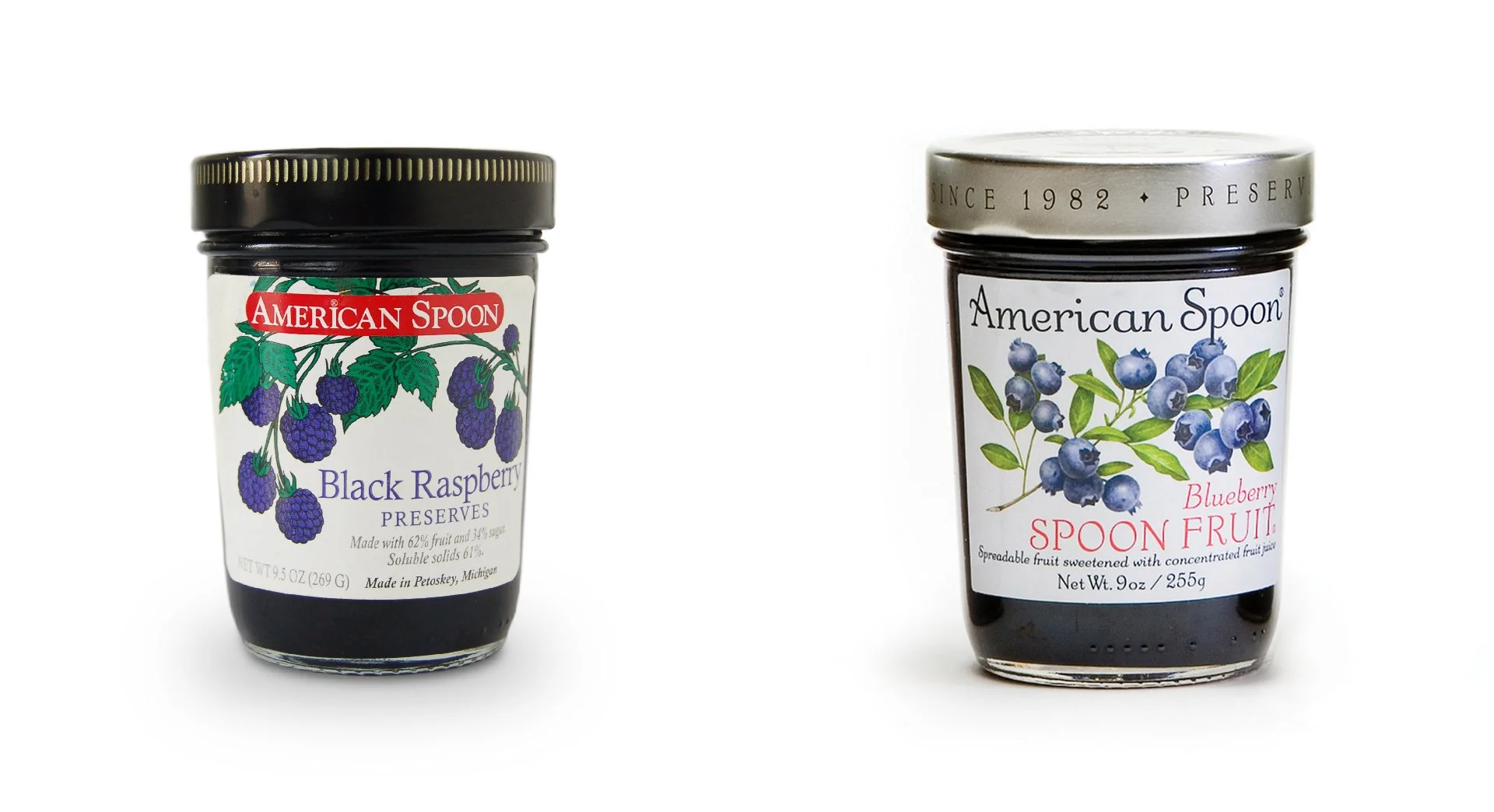
AFTER A QUARTER OF A CENTURY, the legendary Sarabeth's was long overdue for a makeover. Although Sarabeth's signature jar of orange apricot marmalade evoked immediate consumer recognition, a typographic overhaul of the packages was needed to allow the look of the product to measure up its reputation. Keeping the jar intact, Louise Fili Ltd recommended changing the generic printed gold cap to plain silver. While it was important to keep the oval shape for the label, the typography was refined and edited for clarity, a simple, more elegant border was used, and more precise engravings of fruit replaced the previous illustrations.
The new type treatment was carried over to Sarabeth's restaurants, bakery and kitchen, as well as gift boxes, hot chocolate tins and cookie jars. The fresh look is a subtle yet striking difference that underscores Sarabeth's classic identity. Hear what Sarabeth has to say.